
A repainted wall, a moved piece of furniture, a changed fabric on cushions: these simple gestures modify the perception of a room much more than one might imagine. Creating an interior decoration that reflects you doesn’t require a colossal budget or the intervention of an architect. It involves concrete choices, sometimes technical, that deserve to be understood before being applied.
COV labeling of decoration materials: what you buy also breathes
Have you ever noticed a small letter (A+, A, B, or C) on a paint can or a roll of wallpaper? This label indicates the level of volatile organic compound emissions from the product. Since 2013, paints, varnishes, glues, floor coverings, and wall coverings sold in France must display this classification.
Always prioritize products rated A+, which correspond to the lowest emissions. A personalized interior loses all its charm if the air becomes irritating after a few weeks.
Be careful, a blind spot remains: furniture is not subject to this labeling obligation. Sofas, tables, custom storage, or vintage furniture do not fall under the COV classification. When choosing a piece of furniture made from particle board or chipboard, ask the seller for the technical sheet of the materials used. Specialized brands like imaginairdeco.fr often offer detailed product sheets that facilitate this verification.
Since January 1, 2023, regulations also prohibit misleading environmental claims on decoration products. Labels claiming “biodegradable” or “carbon neutral” without verifiable proof have disappeared from compliant labels. Read the pictograms rather than the marketing slogans.
Colors and shapes: composing a space from three visual markers
The classic temptation is to choose a trendy color and apply it everywhere. The result is often monotonous. A more effective approach is based on a simple principle: limit the palette to a maximum of three visual markers per room.
Building your color palette without mistakes
Start with an object you already love: a cushion, a ceramic piece, a painting. Identify two or three dominant shades in it. These colors become your guiding thread for the walls, textiles, and small decorative objects.
White remains a valuable ally for balancing a set. It’s not about painting everything white, but using it as a breath between more colorful areas. A white wall facing a terracotta wall creates a sharp contrast that visually enlarges the space.
Playing with patterns without overwhelming
Patterns bring character to an interior, provided you respect a rule of proportion:
- One strong pattern per room (graphic wallpaper, wide-striped rug, printed curtains).
- The other textiles remain solid or in discreet textures (crumpled linen, corduroy, honeycomb cotton).
- If you layer two patterns, vary the scales: a large geometric pattern on the floor can coexist with a small floral pattern on the cushions.
A well-placed pattern attracts the eye and structures the room, whereas three competing patterns create visual fatigue.
Wooden furniture and raw materials: giving character without following trends
The decoration trends for 2025-2026 confirm a marked return to raw materials. Solid wood, stone, stoneware, and thick linen are making a comeback in living spaces. This is no coincidence: these materials age well and develop a patina over time.
You don’t need to replace all your furniture. One piece of solid wood furniture can anchor the identity of an entire room. A raw oak dining table in a modern living room, for example, creates a focal point around which the rest of the decor naturally organizes.
The mix of eras works better than uniformity. A 1970s armchair next to a contemporary shelf tells a story. The interior gains depth because each object has been chosen, not bought in bulk.
Apartment decoration: organizing a small space with meaningful objects
In an apartment, every square meter counts. Interior decoration becomes an exercise in balancing beauty and utility.
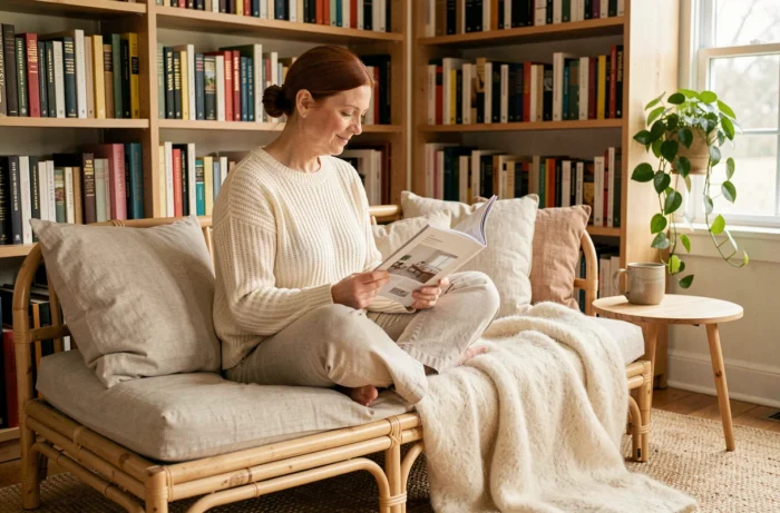
Why this choice between the two? Because in a small space, a purely decorative object that doesn’t provide any storage or comfort ends up being clutter. The solution lies in dual-function objects: a ceramic stool serves as seating and a side table, a mirror enlarges the room while decorating it, a wall shelf displays your books and frees up floor space.
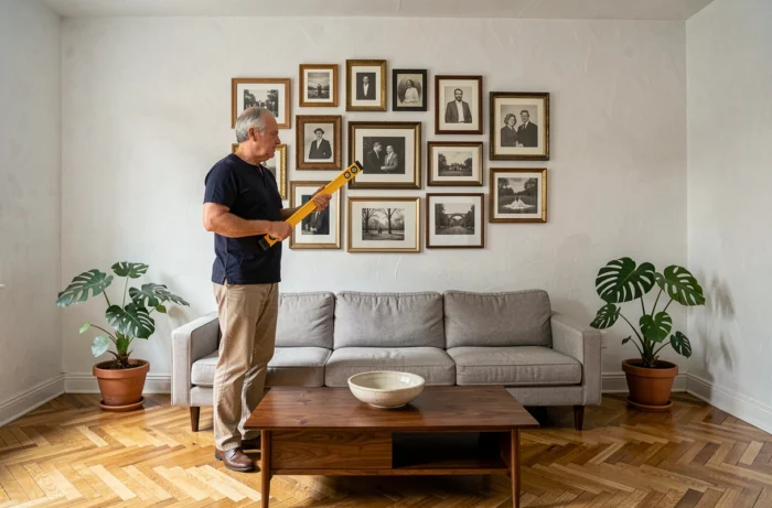
Also think about verticality. The walls of an apartment are often underutilized. Asymmetrical shelves, a low-hanging light fixture above a table, frames arranged in clusters: these choices draw the eye upward and create a sense of volume.
- Hang curtains as close to the ceiling as possible, even if the window is low: the fabric that falls the full height visually elongates the wall.
- Prefer low furniture (sideboard, bench, coffee table) that clears the horizon line in the room.
- Keep the floor as free as possible: fewer floor pieces give an immediate sense of space.
An interior that reflects you is not built in a weekend. The most successful spaces evolve with small touches, an object added here, a textile replaced there, a color tested on a wall before committing. This patience allows you to ensure that each choice stands the test of time, well beyond the season in which it was made.